RIPS / LOS ANGELES
RYPZ / ENDURANCE, WITH A RIP IN IT
RIP OPEN.
KEEP MOVING.
A flavor-coded endurance electrolyte pouch concept and a high-color coastal performance capsule for people who go hard, stay out, and rip.

RIPS
Venice daylight. No finish line.
01 / THE RYPZ POUCH SYSTEM
FLAVOR IS
THE SIGNAL.
RYPZ is pronounced “rips,” like a surfer or skater saying somebody rips. The pouch direction gives that attitude a useful ritual: tear, pour, move.
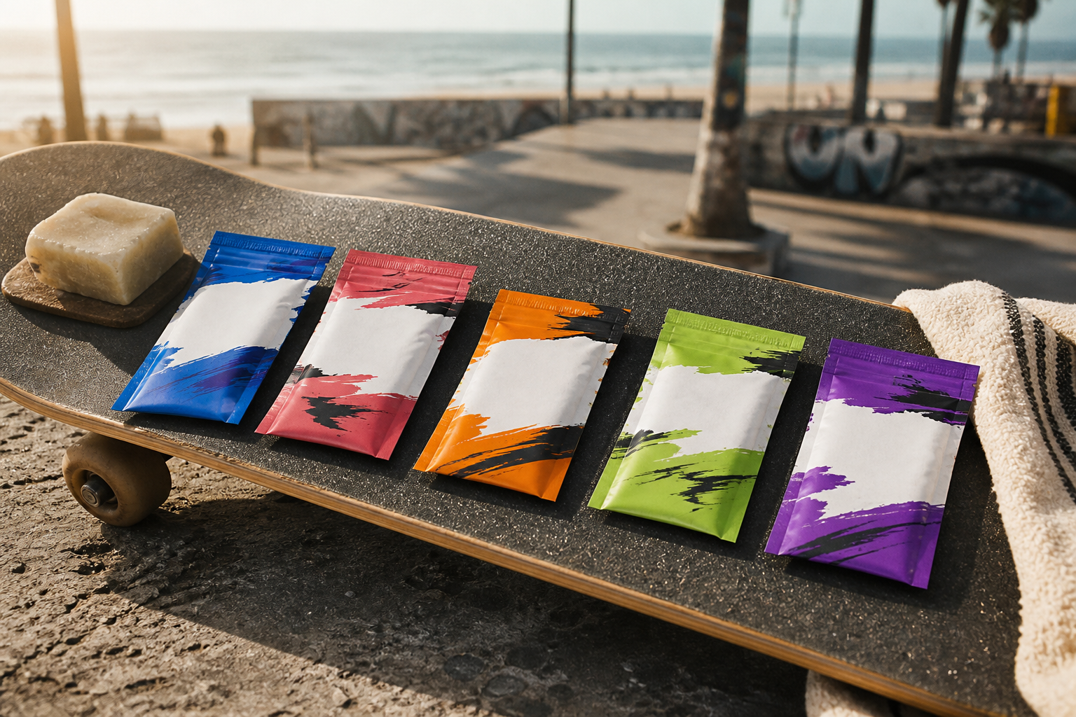
This is an original product-design direction, not a live consumable product or a statement of formula, nutrition, or performance claims.
02 / THE RYPZ ATTITUDE
ENDURANCE
WITH A DIRTY
EDGE.
No clinical wellness language. No quiet performance uniform. RYPZ mixes bright flavor signals, torn brush energy, hard-wearing silhouettes, and the feeling that the best part of the day happens after the plan changes.
03 / SUNLINE CAPSULE
WEAR THE
AFTERBURN.
Eight apparel and accessory directions. Gender intent is explicit, but the graphic language stays one connected system.
04 / VENICE FIELD STUDIES
THE COLOR
KEEPS UP.
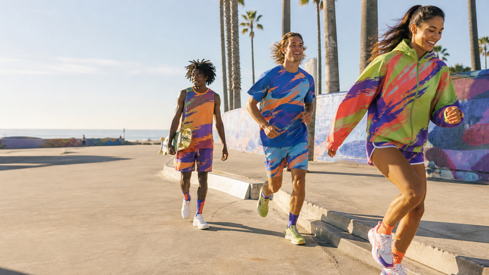
RYPZ / EARLY DIRECTION
IT RIPS.
ON PURPOSE.
RYPZ is an independent creative direction. The wordmark, pouch architecture, flavors, apparel graphics, and lifestyle imagery here are an original pre-production system intended for refining, sampling, and future product development.
Talk to RYPZ ↗